
Cover People is a series I started at the beginning of 2018 to focus on learning, experimenting, and growing as digital artist. With each portrait, I tried to incorporate a new technique or synthesize what I had learned to up to that point. This series continues to be a fun and unpredictable way to challenge myself in the digital realm of portraiture.
#1 – Erica


With Erica, I wanted to start simple, so I chose my little cousin as a subject. I liked her focused stance and contrasting colors of the image. My focus here was work with lines, to capture a certain fluidity to the figure. As for the background, I grabbed my brother’s shirt colors because I wanted it to pop, like a magazine cover!
#2 – Mordecai

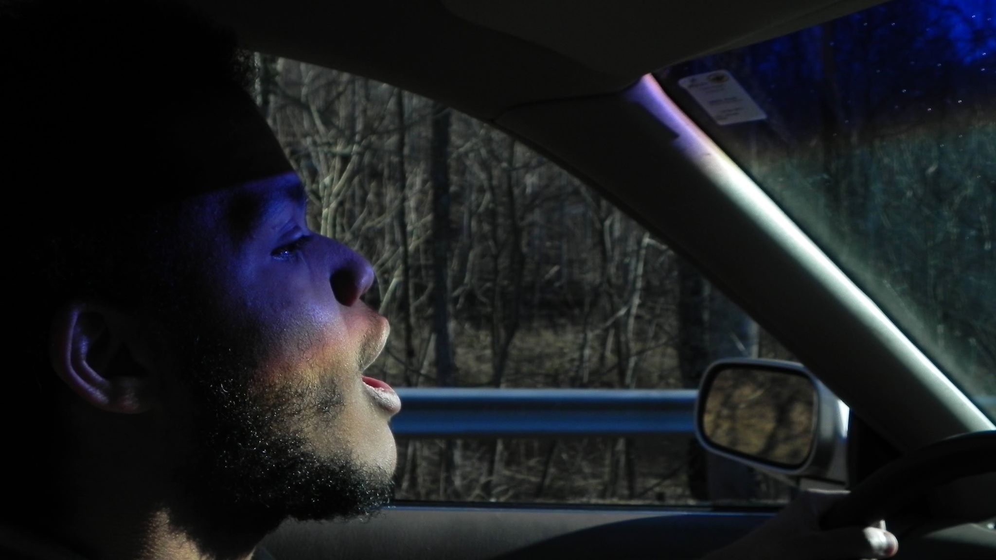
With Mordecai, I wanted to emphasize the magic of the original photo and recapture the moment, with the refracted rainbow splashing his face from the windshield. We were driving down a beautiful country road on a sunny afternoon and he was singing along to something dreamy like Beach House. So, for this second piece, besides recapturing the moment, I also wanted to create a simple, but detailed face much like I did with Erica’s stance, by utilizing light and shadow. You can check out Mordecai’s photography here.
#3 – Nora
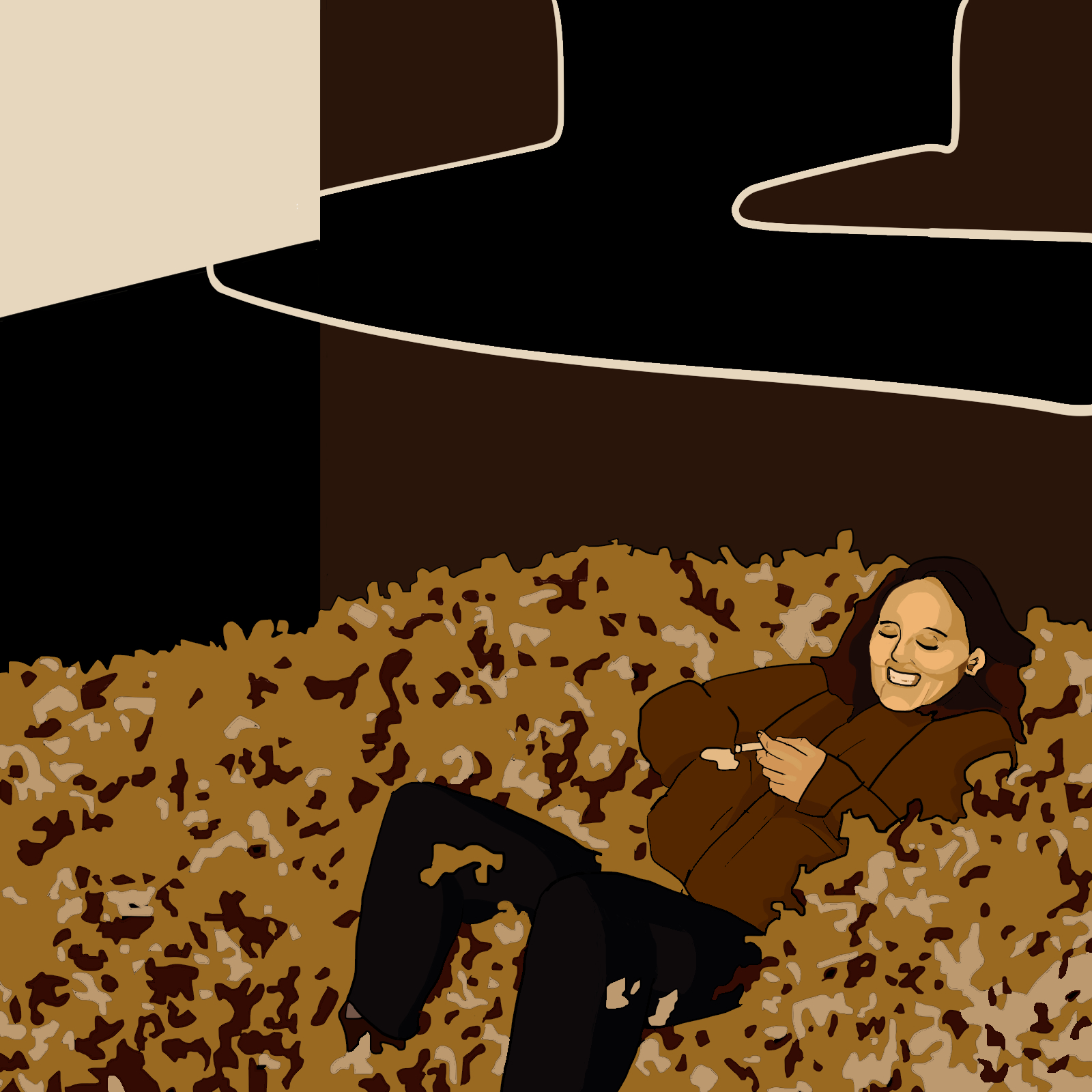
It’s just one of those fall nights when you light a cig and fall into a pile of leaves, classic Nora. With this piece, I wanted to add some texture to the minimalist aesthetic that initially inspired me. Most of the time on this piece was spent drawing the leaf pattern.
#4 – Joey

With my brother Joey’s portrait, I wanted to balance the light and dark. I combined the background principles from the Erica and Nora portraits, using the other people in frame as a color pallet and abstracting the scenery. Rather than make Joe look realistic, I abstracted his shadows as well, making him seem fluid, like the picture as a whole. You can check out Joey’s art here.
#5 – Lori
My mom’s portrait was the first time I tried using photo-manipulation techniques. Look closely and you’ll see I swapped the patterns of her sweater and the lake which created a quilt vibe, much like different fabrics patched together. With her face, I went with only a few hard lines and played more with skin tones. I left the sky open to let the already dense piece breathe, but I wish I went with less saturated colors so it clashed less.
#6 – Andrew


After my first five portraits, I opened the series to commissions to see if any of my friends of family wanted one done. My first costumer was my Mom, see #5, who wanted a picture of her husband/my stepdad. I treated this job as a companion piece to the last, given the similar setting and relationship. I admittedly struggled to render Andrew’s face in the same way as Lori’s, but I had fun creating the pattern of the water from scratch this time.
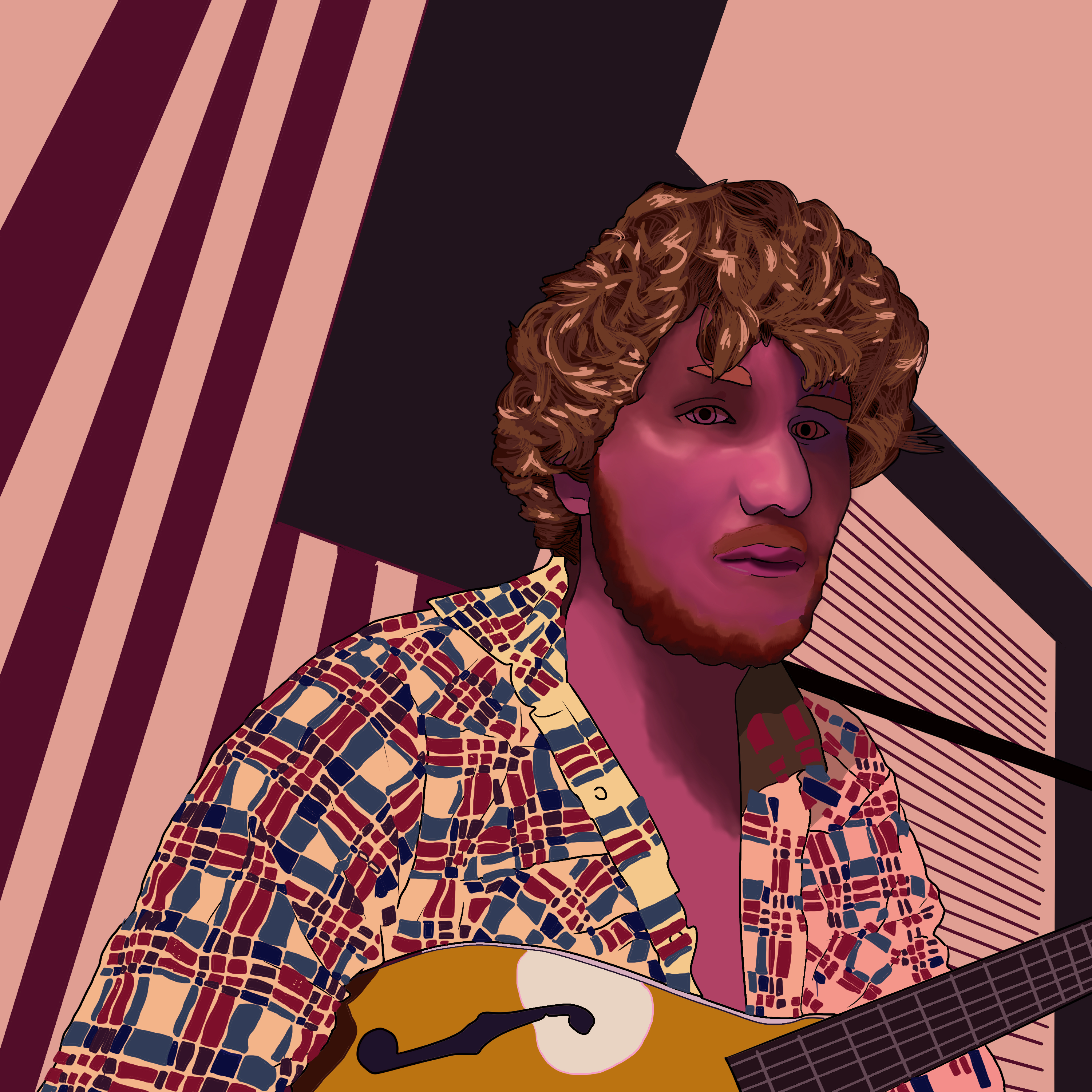
#7 – Micah

Micah was my second patron and the first of my “level 2” works, as I’d describe them. Here, I felt my foundation was strong enough that I could take what I had already practiced and turn it up a notch. I was determined to capture the skin tones of the face without being restricted by lines. The feathers on the shirt were all individually drawn, then repurposed for the texture on the background. The original photo is already marvelous, so I tried to enhance that appeal by using the “saturated abstract” technique that I had been developing up to that point.
#8 – Charlie


For my third commission, my life long friend and talented painter Charlie wagered we do an art trade (you can see his portrait of me here). His pose in this epic bite of rice reminded me of Roman sculpture, so I decided to return to a harder lighting to render his shades, however, this time using the blending tool that I practiced with on Micah, so he looks less blotchy than Joey. The original background is noisy, so I wanted to simplify it while maintaining the candid feel of man in his environment. The navy blue frame was a last minute addition that brought the piece together, making the whole thing feel like an exact moment in time, the most epic bite of rice! The infinity frame was the final touch. You can check out Charlie’s work here.
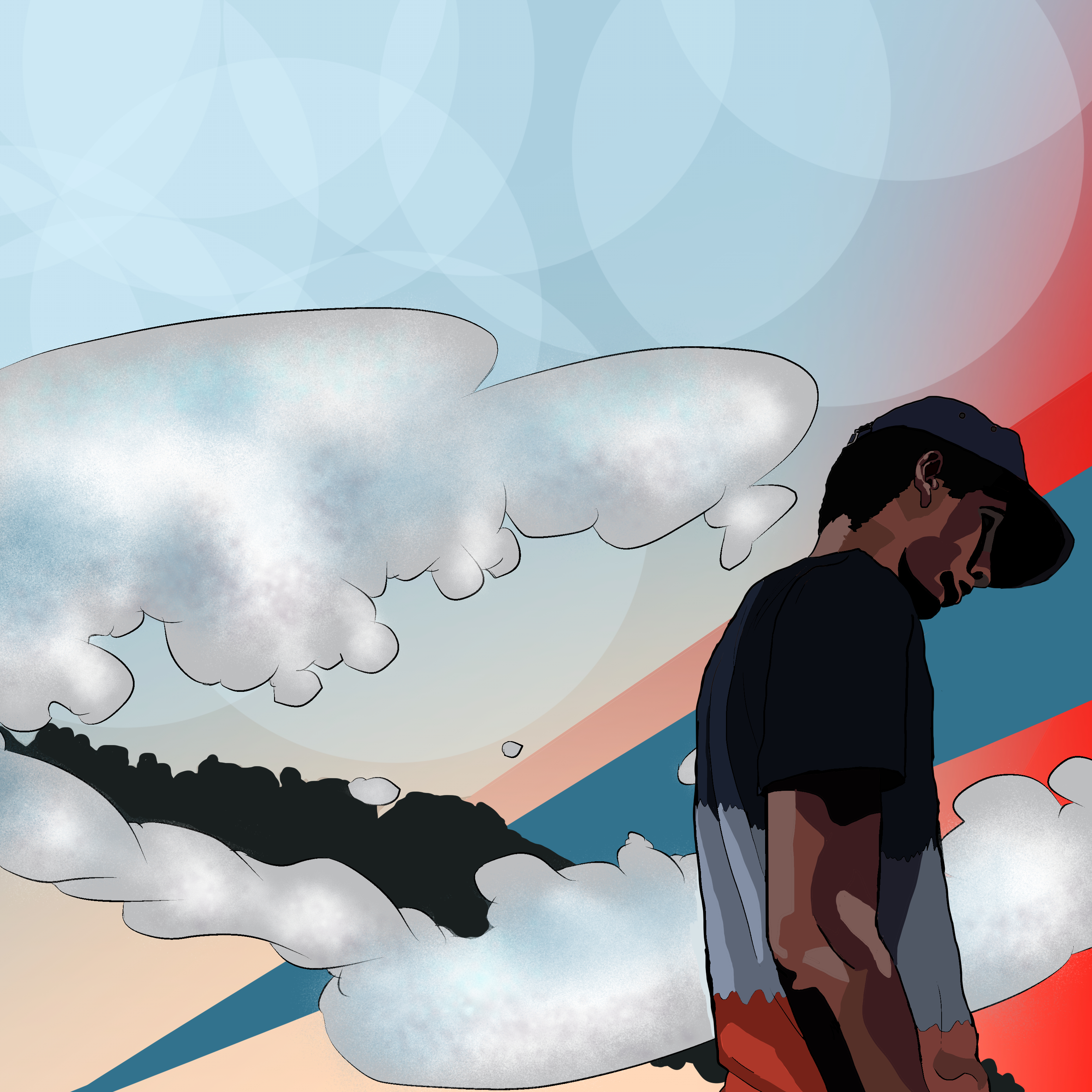
#9 – Jeremy


Further returning to my minimalist approach from the early portraits, Jeremy’s commission allowed me to use this style from a more complex approach. Rather than push the technicality, I experimented with what the style allowed, capturing both his wide eyed innocence and intellectual nature, reflected in the ‘cerebral tree’ as I dubbed it. The design was the most important thing and I’m happy how it turned out!
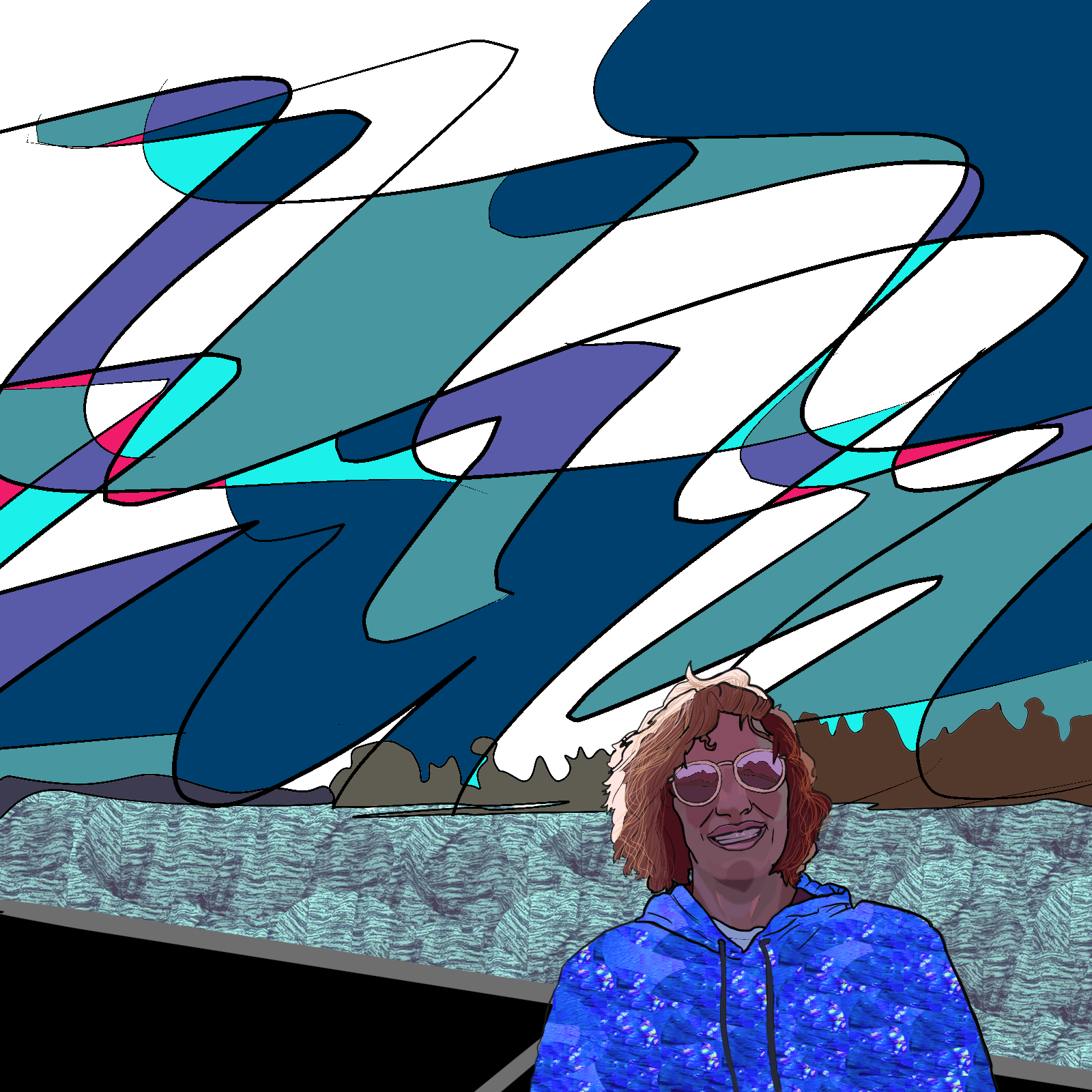
#10 – Jackson

Jackson’s commission was a photo rich with texture and tone and inspired me to try and push those elements, drawing on all of the techniques I had tried up to this point. I also wanted to stick to the primary colors for this one and see what kind of mood I could create with the limited pallet. I feel like I depicted depth well with the highly blended face to the, wavy flannel, to the flat background. You can follow Jackson’s adventure here.
#11 – Yanting


With Yanting’s commission, I focused on using digital paintbrushes to try for a more photo-realistic portrait. This piece was also the first time I played with how the different layers interacted, from the mini portrait of Puppy on her hand, to the text print in the background, cut out of a gradient. The giant eyes are actually saturated abstracts of Puppy’s little eyes. Is Yanting cool yet? Find out here.
#12 – The Tardee Boys*


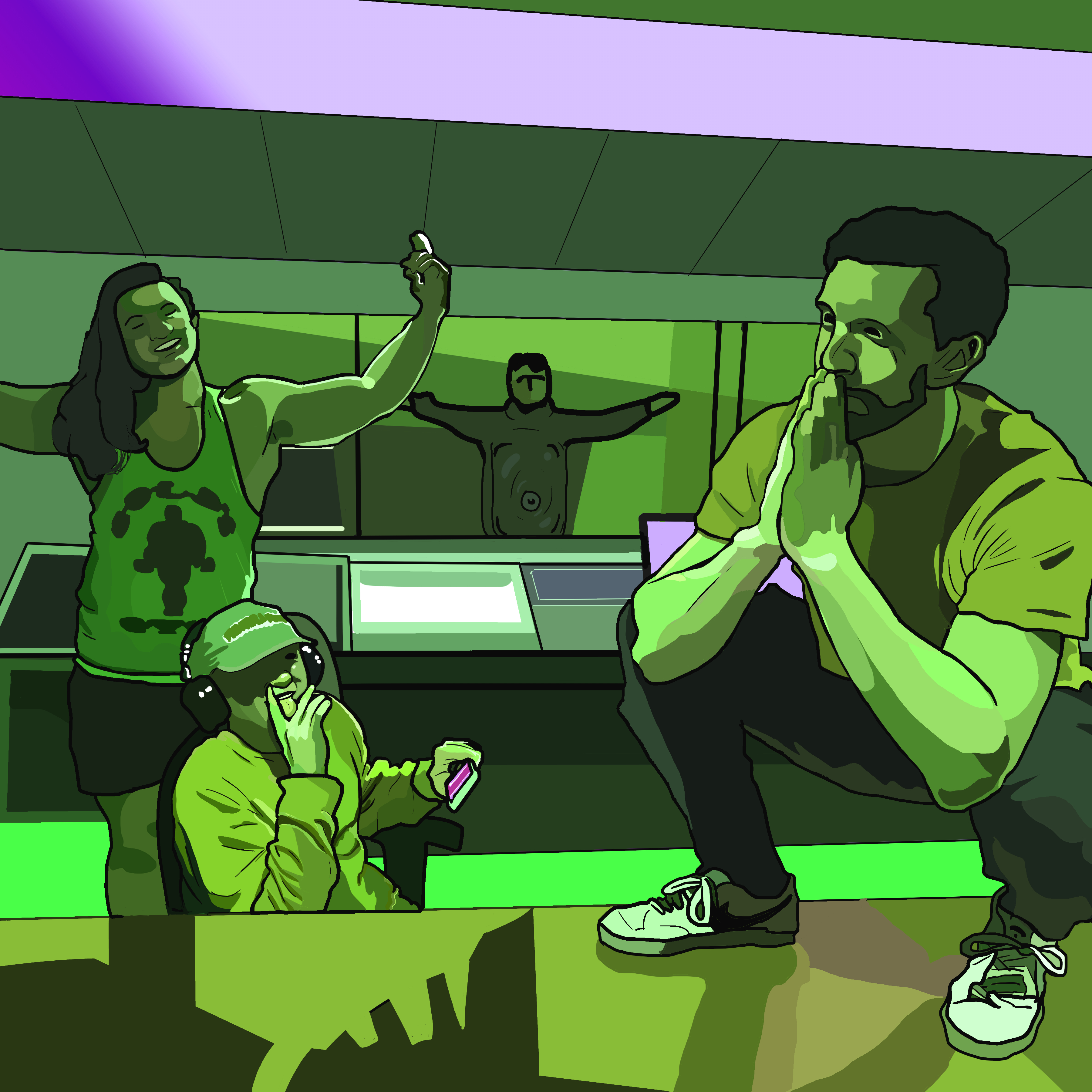
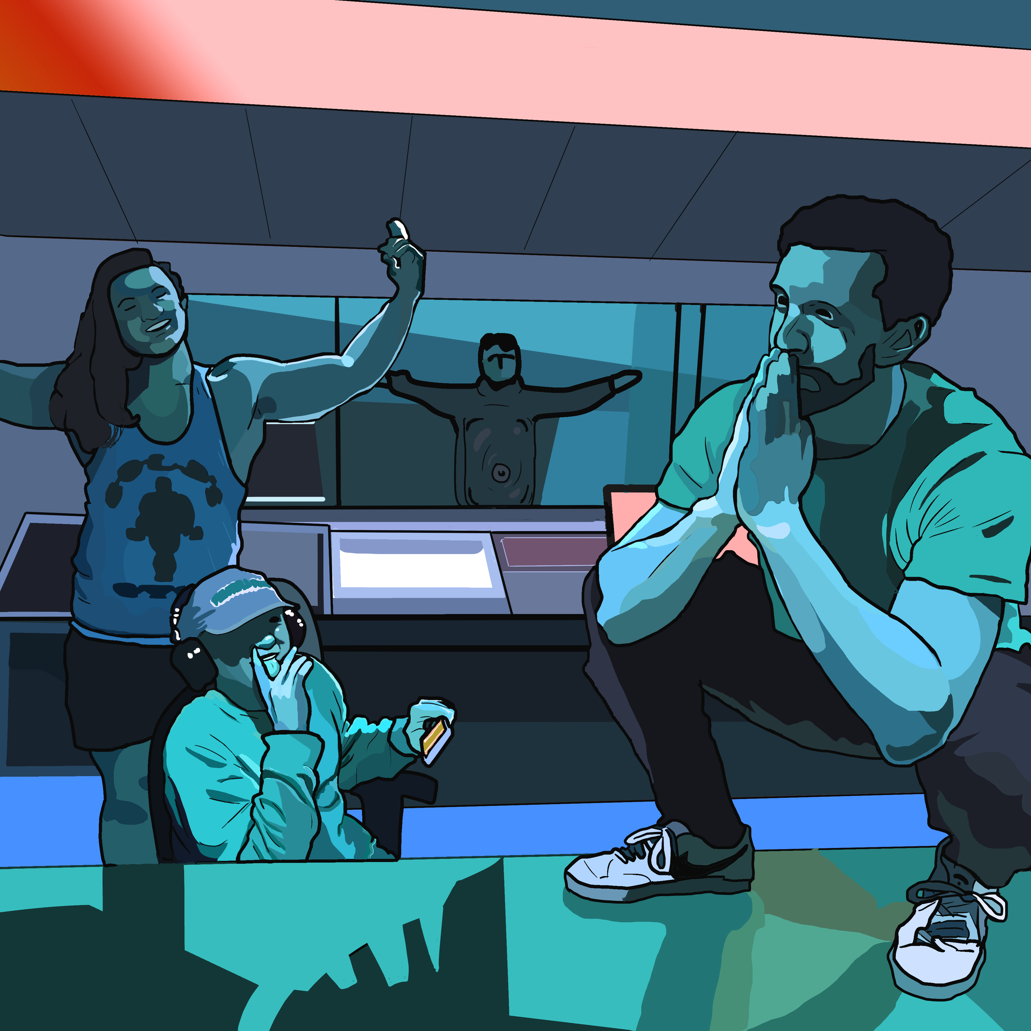
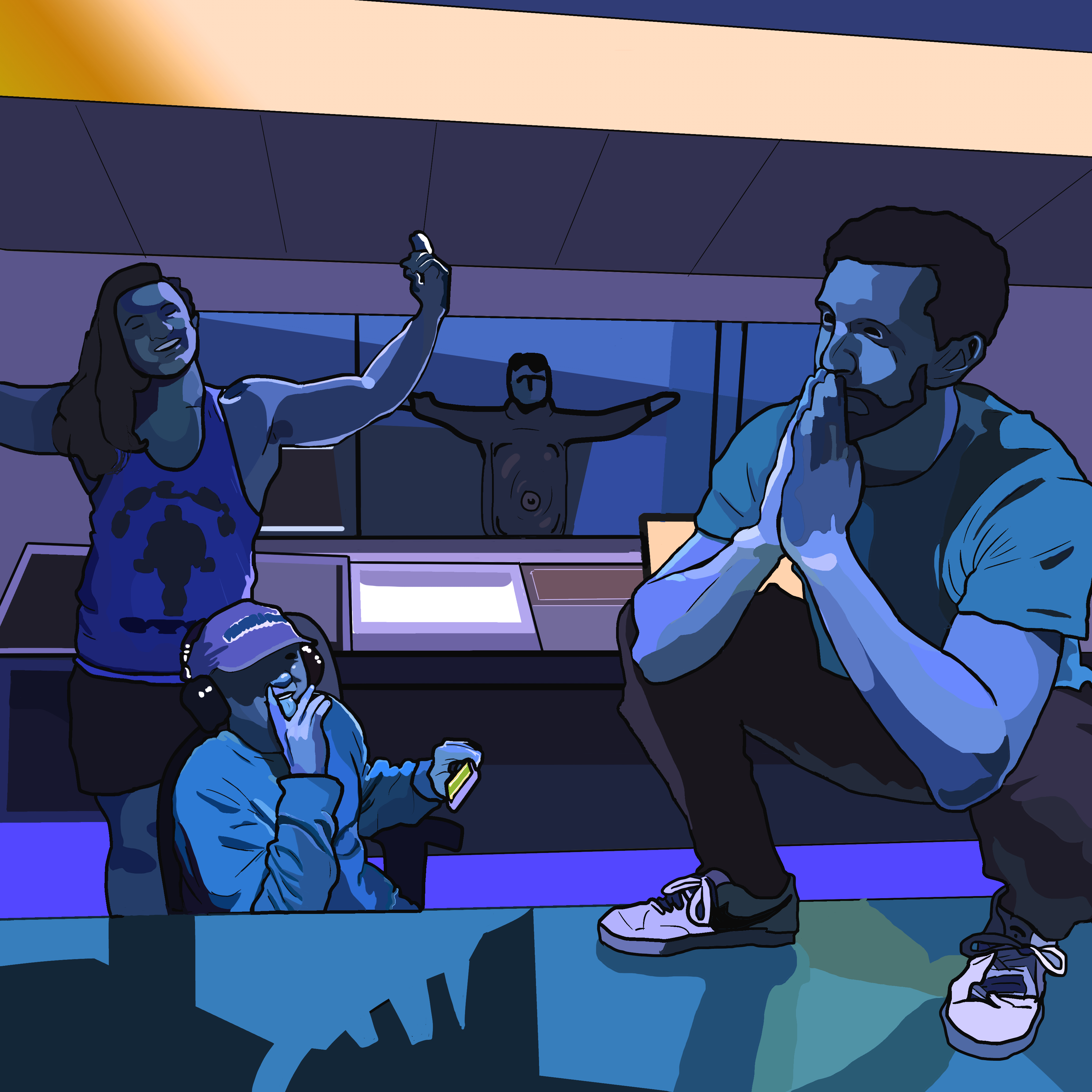

The Tardee Boys (tentative band name) is a work in progress comedy music project. Jackson is a member of this group and commissioned a group photo/album art for whatever they make in the future. This was my first big, multi-person piece with which I took the Jeremy approach- simple characters with a focus on over all design. Pop was the key here. The characters needed to jump off the screen at the viewer. I also decided to throw in some mood alts. On the imaginary level up scoreboard, I’d say this is the first of my level 3 portraits where I am able to cohesively use all of my developed skills.
#13 – Nick


My brother Nick is a fun, loud character and I wanted to convey this to the 10 in his portrait. Stylistically, I did a painted and blended face, layered tie-dyed shirt, and color corrected/photo filtered background. This one is a favorite of mine because I feel like I illustrated what I wanted with better than expected results with relative ease.
#14 – Jacob


Jacob commissioned a cover of an already awesome looking picture, that from my end, turned out a lot more difficult to cover than expected. There are numerous textures and colors at play here, plus this was my first time doing a full body posed portrait, as opposed to my close ups and mid shots of the past. To tackle this project, I used the Joey technique of using a very fluid touch. Everything is flowing and breathing! The background is combination of the people pallet used in Joey’s and new technique of copying and resizing a single layer multiple times over. I twisted the image several times over itself to create a new abstract background. See what Jacob’s up to here.
#15 – Erica and Nick

You’ll notice that this piece isn’t a one to one of the original image. Erica’s mom, my aunt, commissioned a cover of this moment from our last family gathering of Nick and Erica playing together. However, I felt that the picture missed the moment by a few seconds. So, as a challenge to myself, I free handed most of the cover, drawing it from scratch. I decided that the background didn’t fit the mood either, so I appropriated the painting in the background and recreated it using the minimalist techniques from Nora. With all of this, I studied Studio Ghibli’s aesthetic to lend a fantasy/cartoon element to blend the different realities. Definitely my most ambitious portrait to date.
#16 – Eric and Barbara
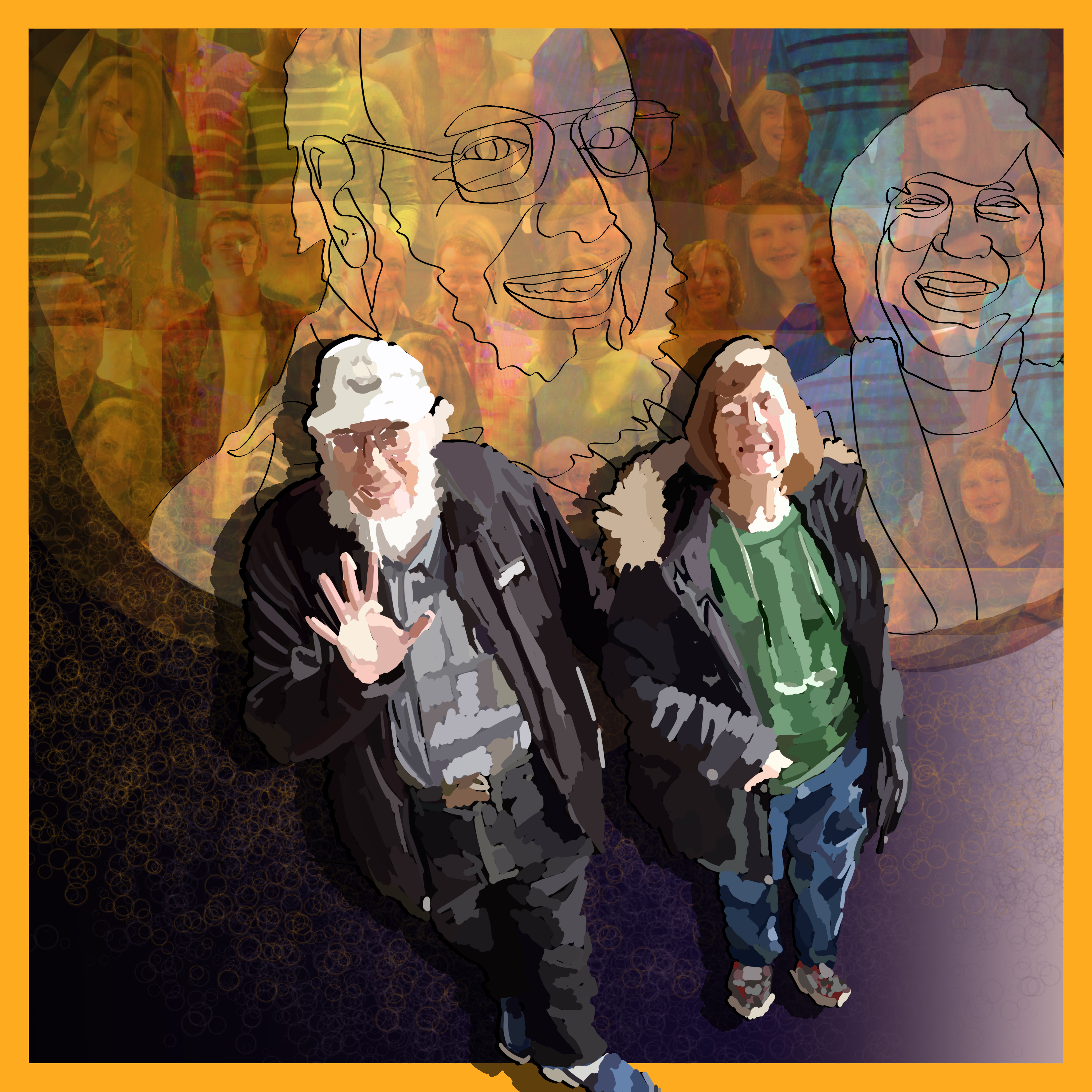


For my grandparents portraits (lovingly commissioned by my mom for their anniversary), I wanted to incorporate more a familial feel, as they are the matriarch and patriarch of the family. I loved the friendly walking shot where Eric waves to the camera so I knew that should be the base. As I was painting it, I discovered the impressionistic base coat looked too cool to lose, so I shifted focus from rendering to leaving it loose and free. With that decision, I still needed to create a portrait, so I decided to juxtapose the flowing colors with simple lines for the close ups, I even tried to do a single line drawing of the faces but proved to be too ambitious, but instances of it can still be seen. Originally, I was going to use the family portrait as a silhouette in the foreground of the piece but that never looked right, no matter how I played with it, so I though, what if I used it as a background instead? As a result, I created a ghostly yet celebratory portrait of my grandparents, highlighting success at rearing a strong family!
Bonus note, the color pallet was inspired by The Soft Bulletin’s album cover. I felt the aesthetic was a good match.
#17 – Mac Miller
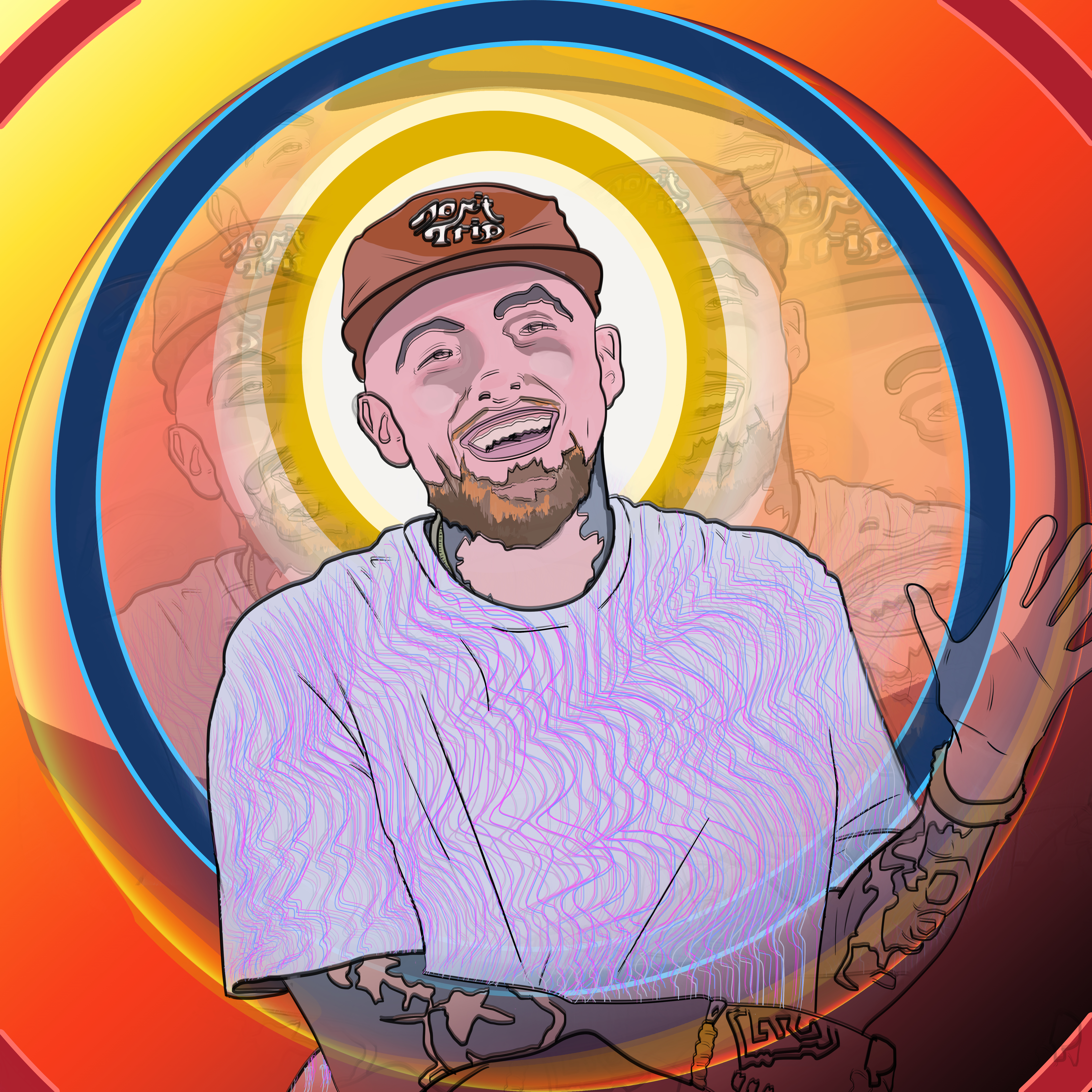

“Music, it’s a beautiful thing. It’s a beautiful thing.”
It struck me when Mac Miller passed, an incredible hip-hop artist at constant war with himself, yet unafraid to confront the darkest corners of his psyche. Just the night before, I was watching his Tiny Desk Concert performance before bed, curious about where he would go next, having found a new peace described on Swimming. Rest well Mac.
#18 – Holway Halloween

Hoorah! The 1st of 5 commissions that I got in October. This time around, I painted two of my patron’s grandchildren in a surreal digital oil painting. My focus was to adhere the realist values of the portrait with a highly saturated color pallet. The background, however, is a color adjusted experiment with the liquify brush applied to the original image. Commissioned by the wonderful Kate Holway of 3 Sisters Catering.
#19 – Holway After School
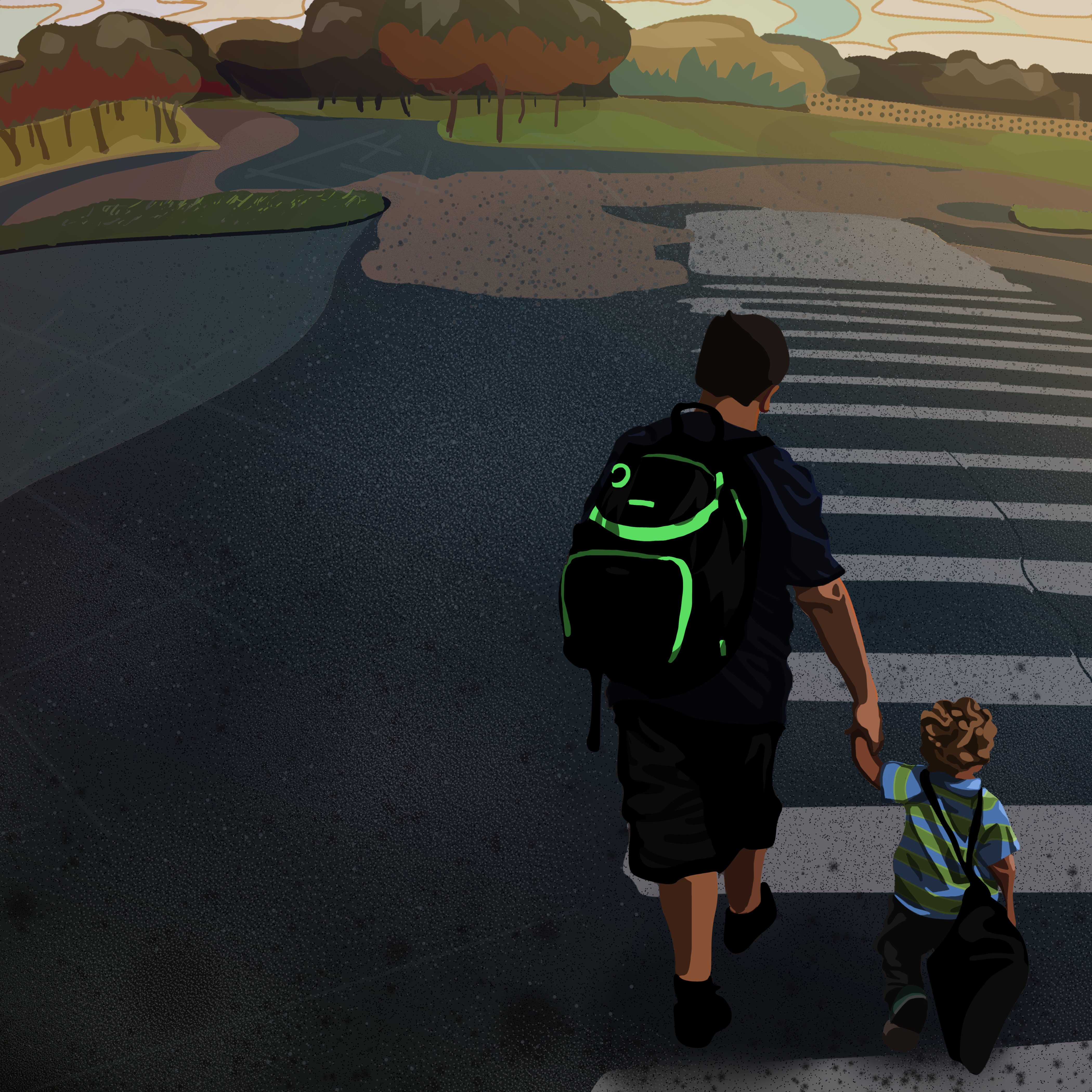

The 2nd commission from Kate Holway depicting two of her family members crossing the road after school. Opposed to the surreal style of the previous pair, I wanted to capture a quieter moment. Using vector shapes and shading I made something of a cartoon photo with some glossy primary color filters.
#20 – Jacob and Sindy


Jacob had me do another cover of an awesome photo from the Imagine Music Festival . He and his girlfriend Sindy embrace with a powerful kiss and I sought to heighten the moment with a poppy and alluring color scheme and some psychedelic warping of the scenery. This was a really fun piece to work on and it fit my style well.
#21 – Deputy Kernan
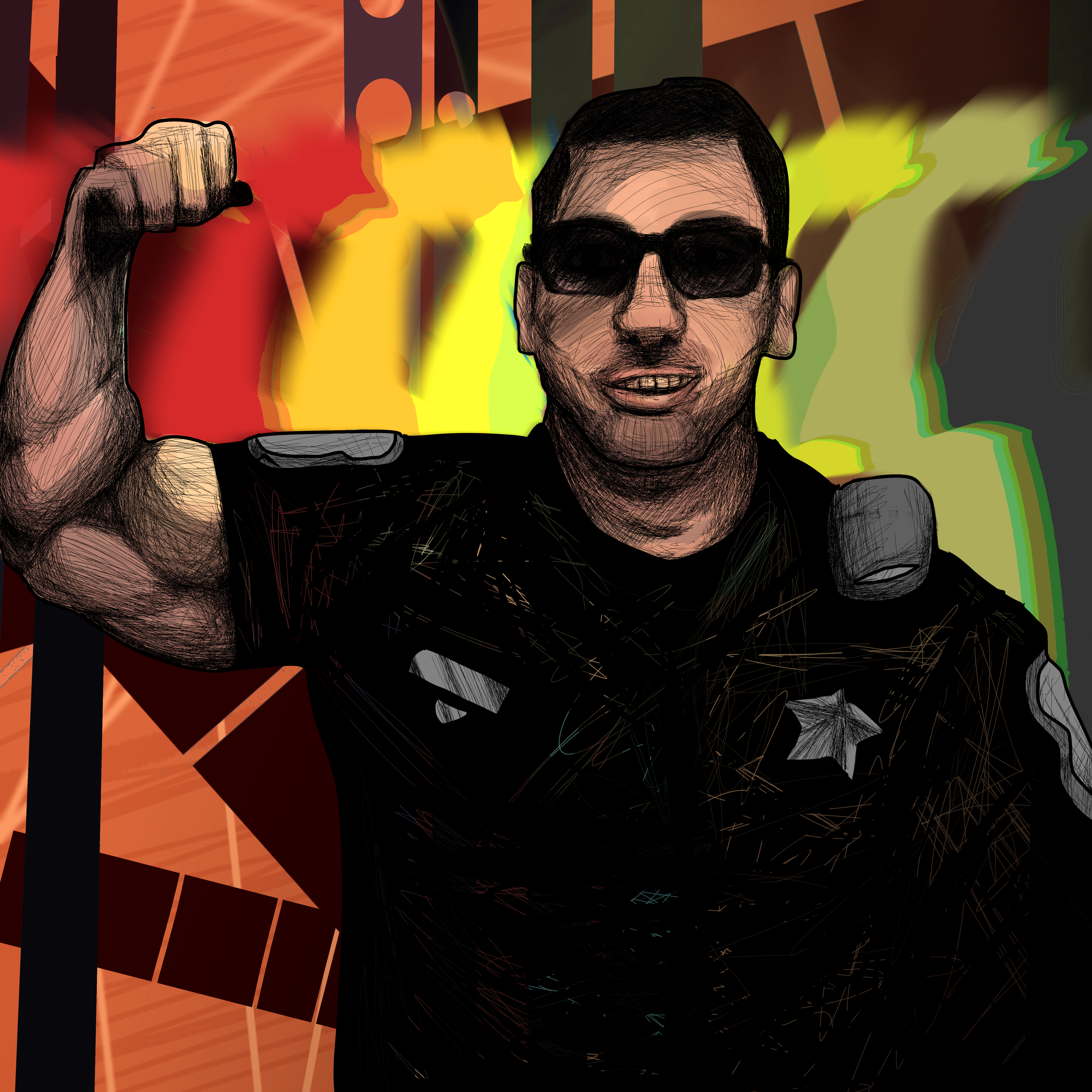


My next commission came from one of my mom’s coworkers, Deputy Kernan. I both enjoyed and struggled with this one, since I never met or had any communication with the deputy, everything was through a third party. The relatively simple base image let me study values, which I chose to approach with hatching this time around. Creating the image with digital pen entirely through hatching with some additional flat inks and following through with an under layer of water colors. When I finished recreating the flex picture, I wasn’t satisfied as the painting was cold and stern. I decided to liven it up by looking into other pictures of Kernan, finding a warmer image where he smiles. I then hybridized the two and changed the color and lighting from cold to hot, bringing far more life to the painting.
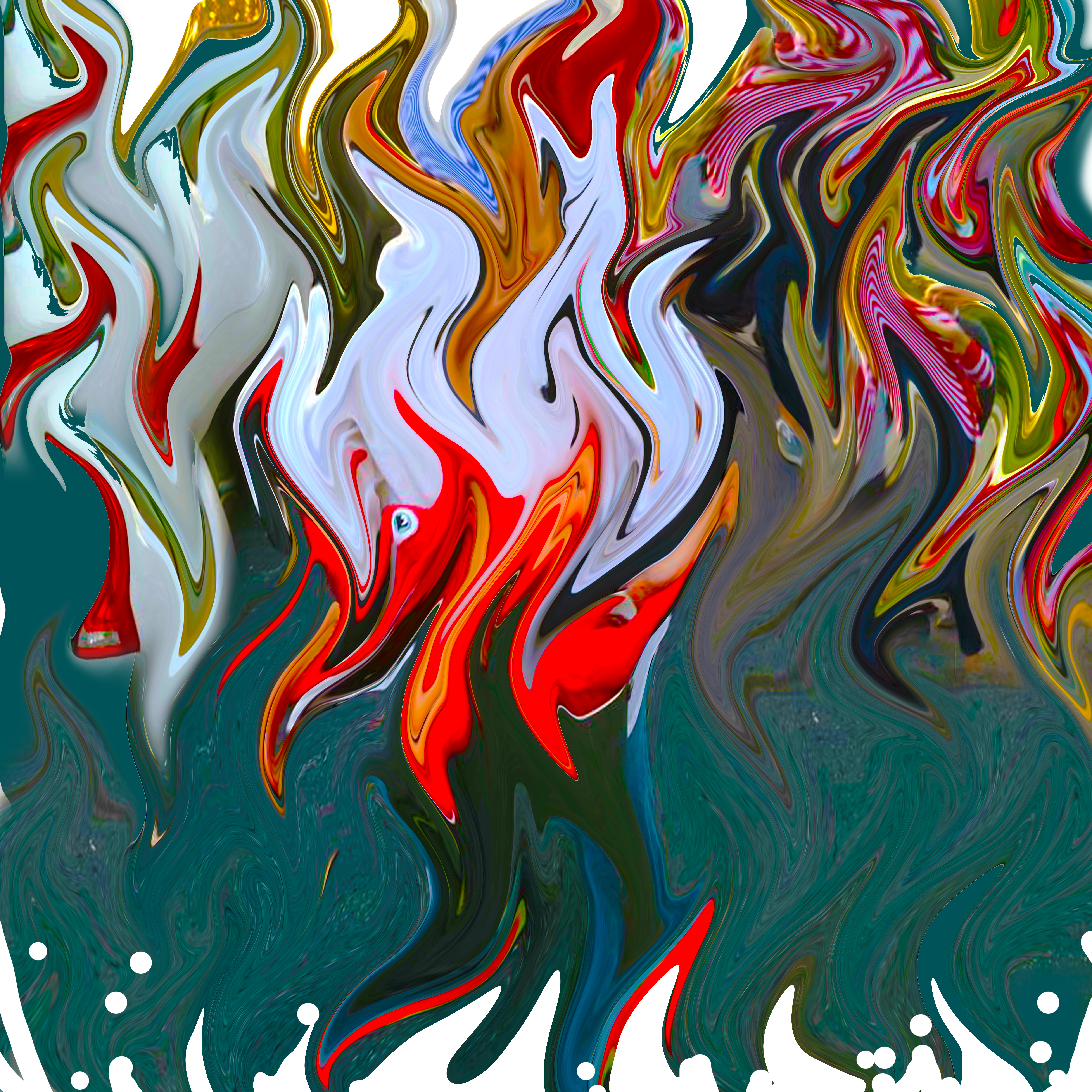
#22 – Fritz
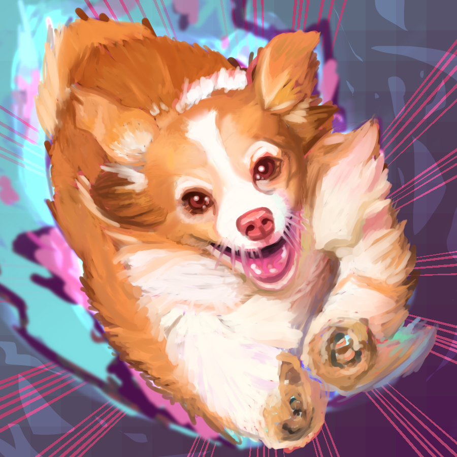

OMG ITS FRITZ! Alive with all of his youthful glory! This photo was one of his last days running free before he succumbed to sickness. Originally, I was reluctant to take on this commission from my mom, as Fritz had passed over a year ago and let sleeping dogs lie, right. I changed my mind and decided to run with him in a bright, energetic digital watercolor. The blue, pink, purple motif came from messing with the saturation of the original image until, these neon flames started emerging from the breaking image, like his spirit running from his body.
#22.5 – Bonus Fritz

Here’s a traditional mixed media portrait of the doggo I drew the day he left us back in 2017. This one carries a different weight. Made with pastel marker, colored pens, and acrylic paint.
.
I hope you enjoyed viewing my journey as a digital artist up to this point. Feel free to check out some of my other paintings on my blog.
If you like the style and want a cover portrait of your own, feel free to message me at petervolpone@yahoo.com. My current price is $50 per portrait, with an additional $20 per subject.

2 thoughts on “COVER PEOPLE 2018 (Digital Portraits)”